R直方图
提示
- 直方图的创建:在 R 中,使用
hist()函数创建直方图,该函数可将数据(如温度值)以条形图的形式展示。 - 添加标题和标签:可以通过向
hist()函数传递main和xlab参数为直方图添加标题和 x 轴标签。 - 自定义直方图样式:在
hist()函数中使用col参数更改条形颜色,使用xlim和ylim参数设置坐标轴的范围。
直方图是使用不同高度的条形图来展示数据的图形显示方式。
直方图用于总结在区间尺度上测量的离散或连续数据。
在 R 中创建直方图
在 R 中,我们使用 hist() 函数来创建直方图。例如,
temperatures <- c(67 ,72 ,74 ,62 ,76 ,66 ,65 ,59 ,61 ,69 )

# temperatures 向量的直方图
result <- hist(temperatures)

print(result)
输出
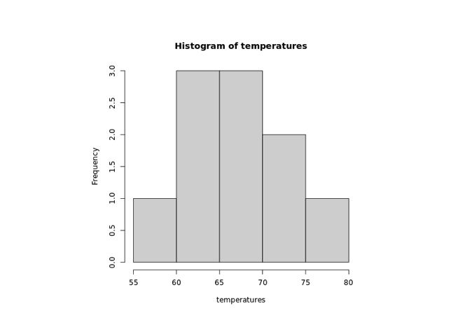
在上面的例子中,我们使用了 hist() 函数来创建 temperatures 向量的直方图。
我们创建的直方图是简单的,我们可以在直方图中添加许多元素。
在 R 中为直方图添加标题和标签
要在 R 中为直方图添加标题和标签,我们分别在 hist() 函数中传递 main 和 xlab 参数。例如,
temperatures <- c(67 ,72 ,74 ,62 ,76 ,66 ,65 ,59 ,61 ,69 )
# temperatures 向量的直方图
result <- hist(temperatures,
main = "温度直方图",
xlab = "温度(�华氏度)"
)
print(result)
输出
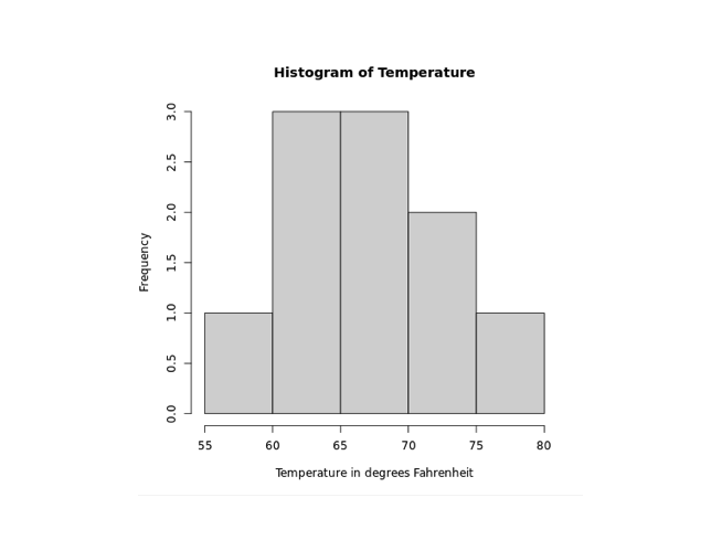
在上图中,我们可以看到我们已经为 temperatures 向量的直方图添加了标题和标签。
hist(temperatures,
  main = "一周最高温度",
  xlab = "温度(华氏度)")
这里,
main- 添加标题"一周最高温度"xlab- 添加标签"温度(华氏度)"
在 R 中更改直方图条形颜色
在 R 中,我们在 hist() 内传递 col 参数来更改条形的颜色。例如,
temperatures <- c(67 ,72 ,74 ,62 ,76 ,66 ,65 ,59 ,61 ,69 )

# temperatures 向量的直方图
result <- hist(temperatures,
  main = "温度直方图",
  xlab = "温度(华氏度)",
  col = "red")

print(result)
输出
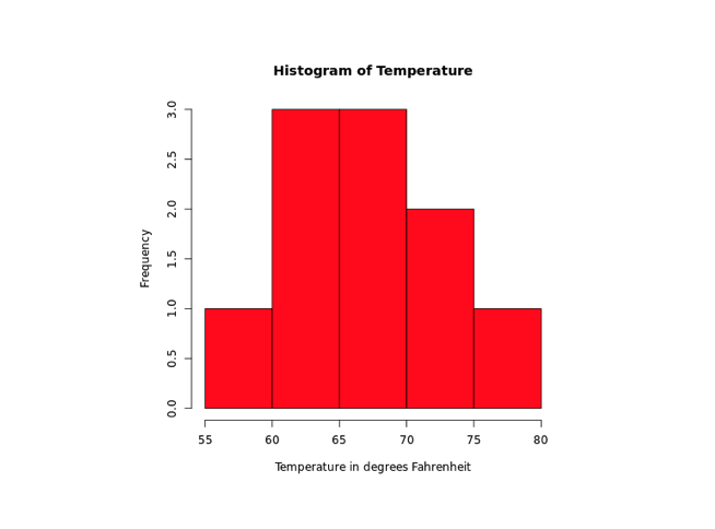
在上面的例子中,我们使用了 col 参数在 barplot() 内更改条形的颜色。
result <- hist(temperatures,
  ...
  col = "red"
)
这里,col = "red" 将条形的颜色更改为红色。
R 中的坐标轴范围
要在 R 中提供坐标轴的范围,我们在 hist() 中传递 xlab 和 ylab 参数。例如,
temperatures <- c(67 ,72 ,74 ,62 ,76 ,66 ,65 ,59 ,61 ,69 )

# temperatures 向量的直方图
result <- hist(temperatures,
  main = "温度直方图",
  xlab = "温度(华氏度)",
  col = "red",
  xlim = c(50,100),
  ylim = c(0, 5))

print(result)
输出
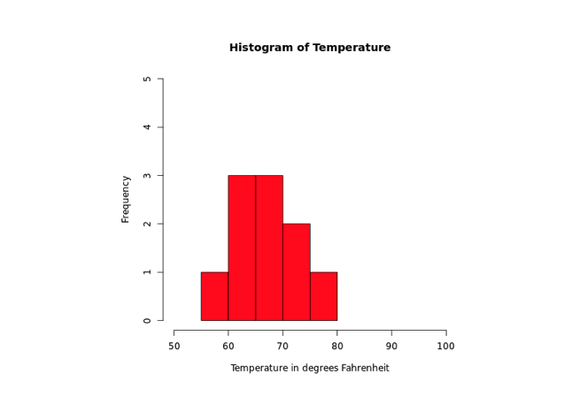
在上面的例子中,我们使用了 xlim 和 ylim 参数在 hist() 内分别提供 x 轴和 y 轴的范围。
result <- hist(temperatures,
  ...
  xlim = c(50,100),
  ylim = c(0, 5))
)
这里,
- x 轴范围从 50 到 100
- y 轴范围从 0 到 5