R条形图
- 柱状图的创建和用途:柱状图是一种有效的数据表现形式,可用于可视化随时间变化的数据,以突出显示趋势。
- R中柱状图的定制:在R中,使用
barplot()函数创建柱状图,并可以添加标题、轴标签、为每个条形命名,以及更改条形颜色和纹理,从而增强图表的信息表达和可读性。 - 柱状图的高级特性:R允许制作水平柱状图和堆叠柱状图,这些高级特性有助于更好地展示和分析数据。
柱状图是表现数据的最有效方法之一。它可以用来以视觉形式概括大量数据。
柱状图能够表现随时间变化的数据,这有助于我们可视化趋势。
在 R 中创建柱状图
在 R 中,我们使用 barplot() 函数来创建柱状图。例如,
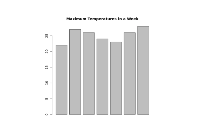
temperatures <- c(22, 27, 26, 24, 23, 26, 28)

# temperatures 向量的柱状图
result <- barplot(temperatures)

print(result)
输出

在上面的例子中,我们使用了 barplot() 函数来创建 temperatures 向量的柱状图。
我们创建的柱状图虽然简单,但我们可以在柱状图中添加很多东西。
在 R 中为柱状图添加标题
要在 R 中为我们的柱状图添加标题,我们在 barplot() 函数内传递 main 参数。例如,
temperatures <- c(22, 27, 26, 24, 23, 26, 28)

result <- barplot(temperatures,
  main = "一周内的最高温度")

print(result)
输出
在上面的图形中,我们可以看到我们已经为 temperatures 向量的柱状图添加了标题。
barplot(temperatures, main = "一周内的最高温度")
这里,main 参数为我们的柱状图添加了标题 "一周内的最高温度"。
在 R 中为轴提供标签
在 R 中,我们也可以为 x 轴和 y 轴提供标签。例如,
temperatures <- c(22, 27, 26, 24, 23, 26, 28)

result <- barplot(temperatures,
  main = "一周内的最高温度",
  xlab = "摄氏度",
  ylab = "天")

print(result)
输出
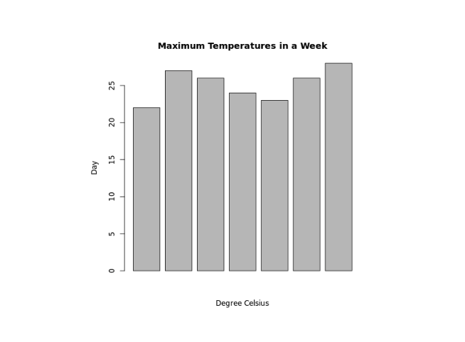
在上面的例子中,我们分别为 x 轴和 y 轴提供了标签。
barplot(temperatures,
  ...
  xlab = "摄氏度",
  ylab = "天")
这里,我们为 barplot() 提供了额外的 xlab 和 ylab 参数:
xlab- 为 x 轴提供了"摄氏度"标签ylab- 为 y 轴提供了"天"标签
在 R 中为条形图的每个条形命名
我们在 R 中的 barplot() 内传递 names.arg 参数来为每个条形提供名称。例如,
temperatures <- c(22, 27, 26, 24, 23, 26, 28)

result <- barplot(temperatures,
  main = "一周内最高气温",
  xlab = "摄氏度",
  ylab = "日",
  names.arg = c("周日", "周一", "周二", "周三", "周四", "周五", "周六")
)

print(result)
输出
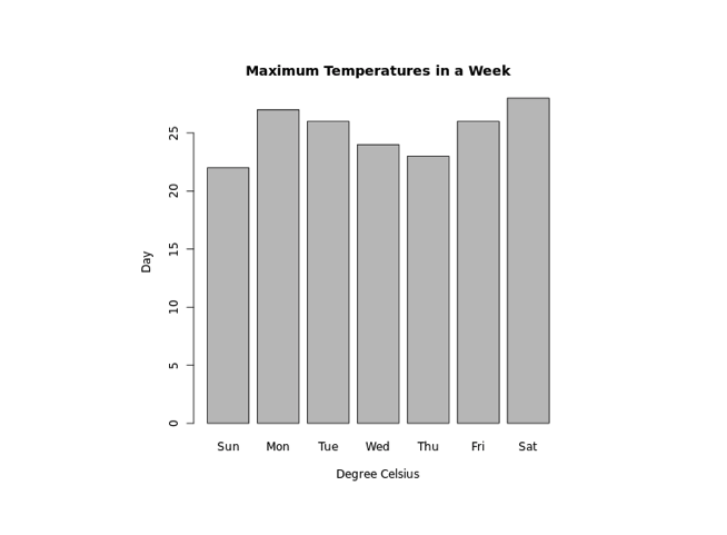
在上面的例子中,我们使用了 names.arg 参数来为条形图的每个条形命名。注意代码,
barplot(temperatures,
  ...
  names.arg = c("周日", "周一", "周二", "周三", "周四", "周五", "周六")
)
这里,我们将 "周日" 分配给第一个条形,"周一" 分配给第二个条形,依此类推。
在 R 中更改条形颜色
在 R 中,我们在 barplot() 内传递 col 参数来更改条形的颜色。例如,
temperatures <- c(22, 27, 26, 24, 23, 26, 28)

result <- barplot(temperatures,
  main = "一周内最高气温",
  xlab = "摄氏度",
  ylab = "日",
  names.arg = c("周日", "周一", "周二", "周三", "周四", "周五", "周六"),
  col = "蓝色"
)

print(result)
输出
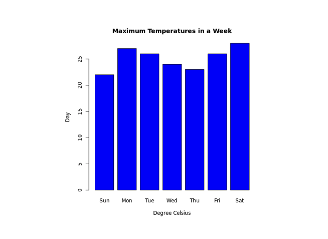
在上面的例子中,我们使用了 col 参数在 barplot() 内更改条形的颜色。
result <- barplot(temperatures,
  ...
  col = "蓝色"
)
这里,col = "蓝色" 将条形的颜色改为蓝色。
R 中的条形纹理
要在 R 中更改条形的纹理,我们在 barplot() 内传递 density 参数。例如,
temperatures <- c(22, 27, 26, 24, 23, 26, 28)

result <- barplot(temperatures,
  main = "一周内最高气温",
  xlab = "摄氏度",
  ylab = "日",
  names.arg = c("周日", "周一", "周二", "周三", "周四", "周五", "周六"),
  col = "蓝色",
  density = 20
)

print(result)
输出
在上面的例子中,我们在 barplot() 内使用了 density 参数来改变条形的纹理。
result <- barplot(temperatures,
  ...
  col = "blue",
  density = 20
)
这里,density = 20 为所有蓝色的条形提供了密度为 20 的纹理。
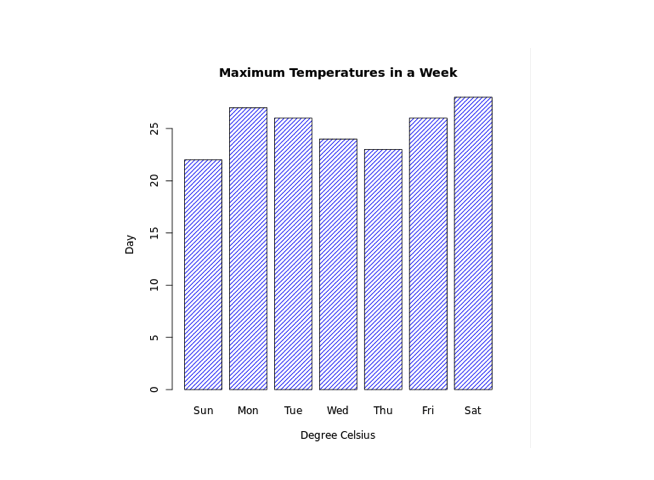
在 R 中制作水平条形图
在 R 中,要使我们的条形图水平显示,我们在 barplot() 内传递 horiz 参数。例如,
temperatures <- c(22, 27, 26, 24, 23, 26, 28)

result <- barplot(temperatures,
  main = "一周内最高气温",
  xlab = "摄氏度",
  ylab = "日",
  names.arg = c("周日", "周一", "周二", "周三", "周四", "周五", "周六"),
  col = "蓝色",
  density = 20,
  horiz = TRUE
)

print(result)
输出
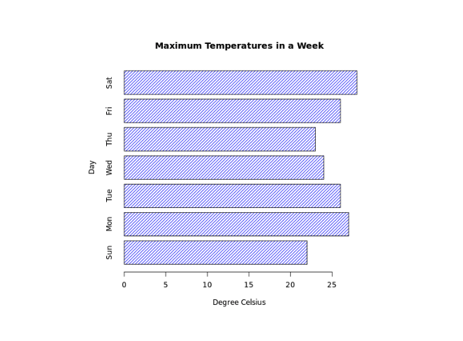
这里,horiz = TRUE 在 barplot() 内传递,改变了图表的方向为水平。
在 R 中制作堆叠条形图
R 允许我们使用 矩阵 作为输入值来创建堆叠条形图。例如,
# 创建矩阵
titanic_data <-  matrix(c(122, 203, 167, 118, 528, 178, 673, 212),
nrow = 2, ncol = 4)

result <- barplot(titanic_data,
main = "各舱级的幸存情况",
xlab = "舱级",
names.arg = c("一等舱", "二等舱", "三等舱", "船员"),
col = c("红色","绿色")
)

legend("左上角",
c("未幸存","幸存"),
fill = c("红色","绿色")
)

print(result)
输出
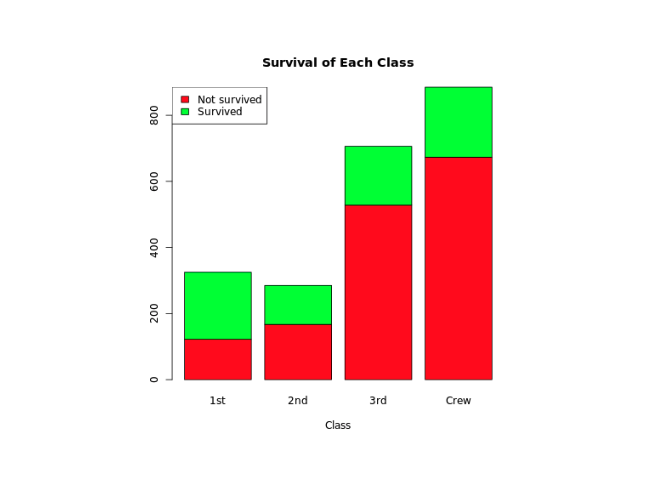
在上面的例子中,我们创建了一个名为 titanic_data 的矩阵,第一行 包含非幸存者的数据,第二行 包含幸存者的数据。
barplot(titanic_data,
  ...
)
这里,我们在 barplot() 内传递了 titanic_data 来创建堆叠条形图。
我们还使用了 legend() 函�数为我们的条形图添加图例。
"绿色"代表"幸存""红色"代表"未幸存"。